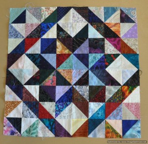
On Thursday, May 22, 2014, I attended a workshop led by Dianne Jansson of Pritchard, BC. The class was a scrap quilt workshop where we learned to work with value rather than colour. Dianne led us through a series of exercises using a combination of light, medium, and dark value fabrics to design projects.

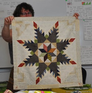
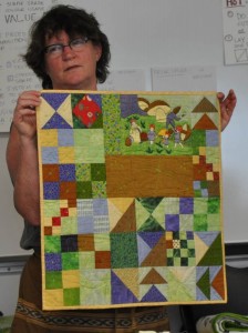
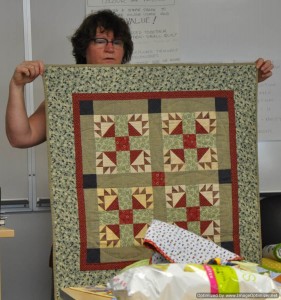
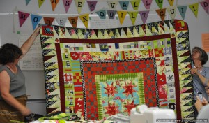
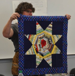
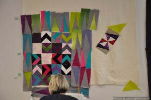
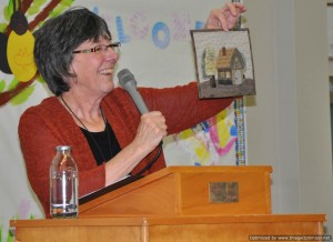
This is a picture of Dianne showing our Guild one of her many quilts during her trunk show the night before our class.

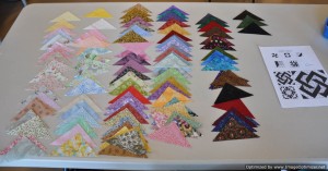
To give our triangle stash some variety, we brought five bags containing 20 triangles to swap with other class participants. This was a good thing, as I soon discovered that my stash is predominately mediums. I don’t have many fabrics of dark value in my stash.


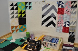
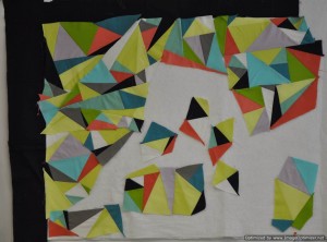
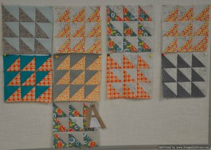
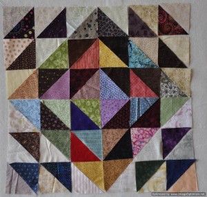
Dianne led us through a series of exercises where we worked with our triangles on our flannel boards. This class was not about sewing, but about developing the skill of value placement in our quilts.
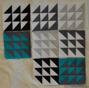
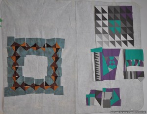
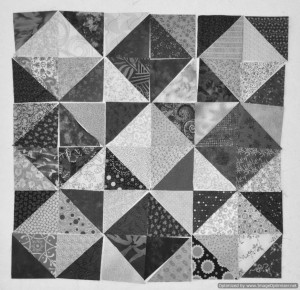
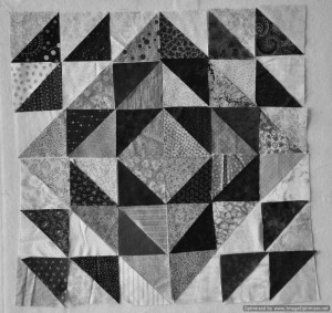
In the first exercise, we made Pinwheel blocks–one that was dark and light, one that was dark and medium and one that was medium and light. We learned that using your camera on its black and white setting would help us see value easier.

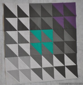
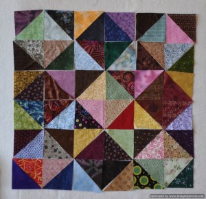
Lesson 2 was to make a Nine Patch from four sets of half triangles arranged in a Square in a Square setting. If you look closely, you will see the star that is formed in the center of the piece. If you put dark value fabrics as the star points, the star is a little easier to see. 
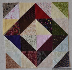
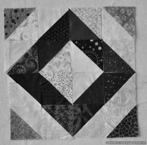
 In lesson 3, we arranged our blocks so that a dark value square on point was visible.

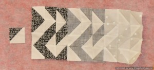
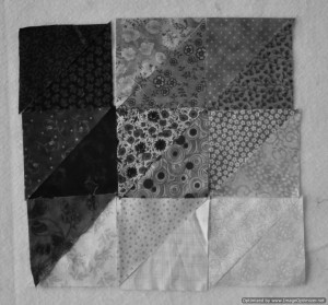
Lesson 4 was an Attic Window arrangement. Dianne told us that this would be the ugliest arrangement she would have us do. She was right. I guess mine was so ugly that I forgot to take a picture in colour!

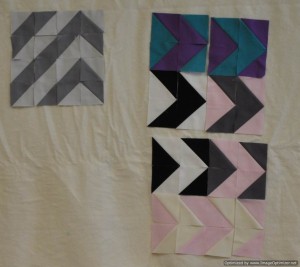
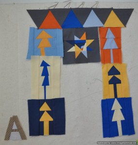
Lessn 5 reminded me of a Birds in Flight arrangement. This arrangement was my favorite.
After working through the exercises with Dianne, I learned that value refers to how light or dark a color is in relation to surrounding colors. By using value rather than the colour of a fabric, I can decide how to arrange fabrics in my quilts to either make them blend or contrast with each other. It is this varying degree of contrast which will allow the design to emerge, not the colour.


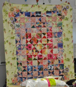
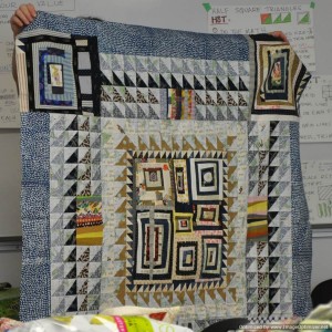
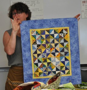
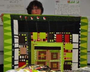
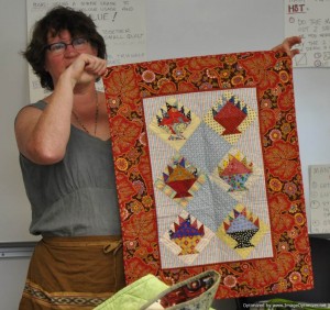
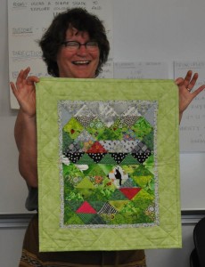
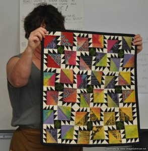
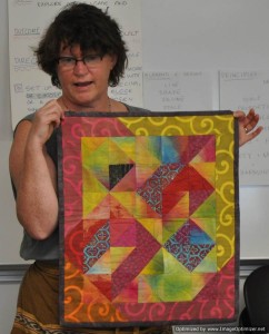
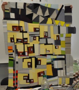
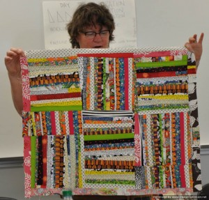
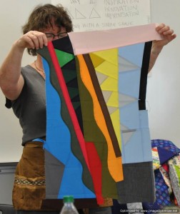
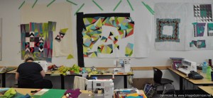
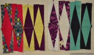
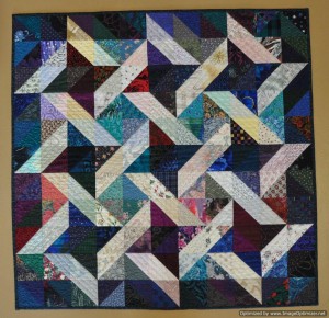
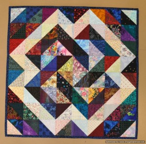
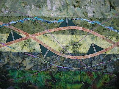
 These three quilts were Dianne’s class samples.
This was a great class. I am anxious to put my new skills to use in my future projects!
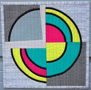 The pieces of this quilt were constructed in a Terry Aske Circles, Circles, Circles workshop that our guild held on March 22, 2018. Although Terry taught us the technique, the design is my own. When I brought the four quarters of the block home from the workshop I almost discarded them as they sure didn’t look like much. Once I gave them a good press and trimmed up the edges, I could see the potential and when Jackie announced the challenge, I was inspired to finish the piece into a 12 in square miniature quilt.
