 I have been reading in quite a few blogs about the pets that different quilters have. So I thought I would share a little about a pet that I have, a cat named Joey.
Back in 2005, we had two dogs–a large German Shepherd named King that lives predominately outside and a small toy poodle named Nikki that lived predominately inside. By the latter half of 2005, Nikki was definitely showing her age with the numerous health problems she had.
My daughter had been begging for a kitten for quite some time and we had always said, no to her. After all, we already had two dogs, we didn’t really need a cat. Finally, my husband said we should probably be saying yes to her, and not continually denying her request to have a cat. After all, we knew we would not likely continue to have two dogs for much longer as we knew that Nikki would likely have to be put down very soon–she was failing fast and there was nothing that could be done for her.
In November my husband thought he had found the perfect kitten for her. My husband works at one of the government’s research stations here in Canada and knew of a kitten that was going to be in need of a good home. It had been befriended by the dairy students and they had been carrying it around all day in their pockets. They were going to be returning to university and could not take the kitten with them. Who could resist a pocket-trained kitten?
I agreed that this sounded like the perfect kitten for our daughter and so we broke the news to her. She was so excited! My husband returned to work the next day prepared to claim the kitten only to find out that someone else had beaten him to it. Now what were we to do? We had promised a kitten to our daughter. Well, now the hunt was on. “Mom, if I can find another kitten, can I still get a kitten.” I said sure thinking that it would take some time to locate a kitten. Lo and behold she had a friend who needed to find a home for some kittens and we could have one right away.
On December 11, 2005, I sent Dana with her Dad to the farm to have a look at this kitten. I told them both that if Dad felt the kitten was healthy and suitable they could bring it home. (I didn’t really think that they would return from that excursion without said kitten.) Dana was so pleased. She brought home a small black ball of fluff–a Persian cross kitten. It was terrified and lived behind our couch for days. We only got glimpses of it from time to time.
Nikki only lived for another week. She died on December 18, 2005. However, the week she lived with Joey, I swear she taught him everything she knew. Joey exhibits several characteristics that remind me of Nikki–even though he is a cat and Nikki was a dog!
We took the kitten to the vet to have a check up shortly thereafter. We thought the kitten was only 3 months old. The vet had a look at the kitten and said that it might be the size of a 3 month old, but it was definitely older than that – at least 6 months old. Our vet said that the kitten was old enough to be fixed and we could have it de-clawed at the same time. We thought that we would have to wait to have this done until the kitten was older. We ended up leaving the kitten with the vet with a promise to check on it the next day.
When I called the vet the next day to check on how things had gone the vet was laughing so hard she could barely talk. My daughter had named the kitten, Tia, which means princess. The vet was saying to me, “How attached are you to the name, Tia? We have started calling the kitten, Mr. T”. Well it turns out that Tia was a boy, not a girl! We took in a 3 month old female kitten to the vet and got back a 6 month old male kitten. We still laugh to this day about this.
Once the kitten came home, Dana started working on a new name and Joey was what stuck. It turns out that Joey has become very much my cat, not my daughter’s. This is no fault of my daughter’s. She loves Joey–he just prefers to be with me. It doesn’t matter what I am doing in the house, Joey is not too far away. Even though he has only been with us for 19 months, I can honestly say I don’t know what it was like before he was with us.
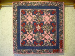
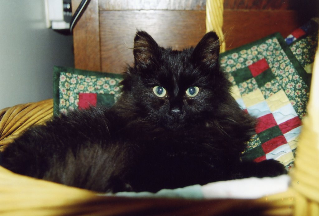
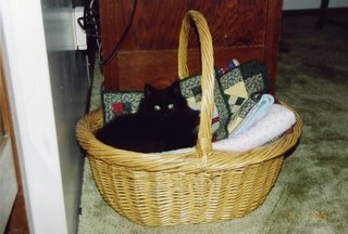
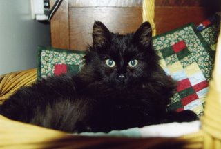
These pictures were taken in December 2005 shortly after we got Joey. Notice he has chosen to sleep on the quilts! These pictures surfaced when I had the 35 mm film developed that was in my camera when my digital died just before Grad. What a surprise to see these old photos!
 I found this little quiz on the internet. When I answered the questions it told me that my ideal pet was a cat! Imagine that!
| Your Ideal Pet is a Cat |

You’re both aloof, introverted, and moody.
And your friends secretly wish that you were declawed! |