Thank you to all who posted comments or e-mailed me with your suggestions for the border treatment on my challenge quilt. There were many great suggestions – many of which I will be saving for use in future quilts.
I will be including the inspiration photo on the label for the back of this quilt. Labels have to be covered for the voting of the quilts on guild night. I am going to ask if I can display my inspiration photo next to my quilt for the voting.
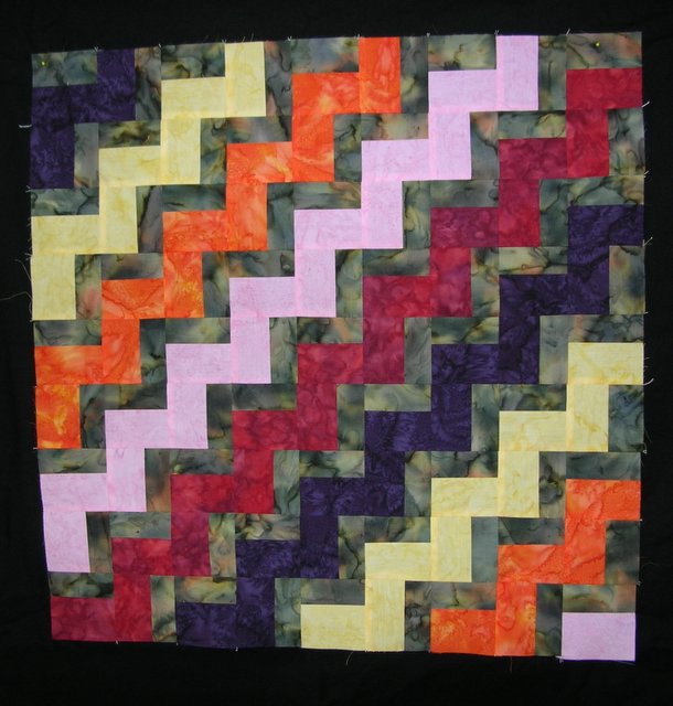
I love the suggestions for a piano key border or small rectangles “floating” in the border. (I am definitely going to use this idea on a future quilt!) However, I only had one fat quarter of the challenge fabric and I used all but one small piece to do the centre of the quilt. I felt I should be including the challenge fabric in the border if I were going to do a piano key or rectangle border so I passed on these ideas for now.
If I had more time, I would have done my zig-zag down the quilt in quarter circles or drunkard’s path blocks. Because I have such precious little time to finish this, the more complicated curved piecing was out. I also considered something like this for the border but a lack of time ruled it out.
I liked the suggestion of putting the theme of the challenge, “The Beauty of the Earth ” in words on the border. I tried using the embroidery alphabet feature on my sewing machine to put the words in the border. However, after some fiddling and experimenting, I felt I should spend more time familiarizing myself with this feature on my machine before attempting to include words on the front of my quilts. Because of the small size of the quilt, Tonya’s free form letters were ruled out on this one.
Linda J. thought that a narrow black border followed by a wider red border might work. I ended up with just that–a narrow black border and I found the perfect “tulip” tone on tone red fabric for the outer border. Linda also sent me a link to the words for the hymn, “For the Beauty of the Earth”. I had not made the connection to that hymn until that point. I will be using this hymn as part of my label.
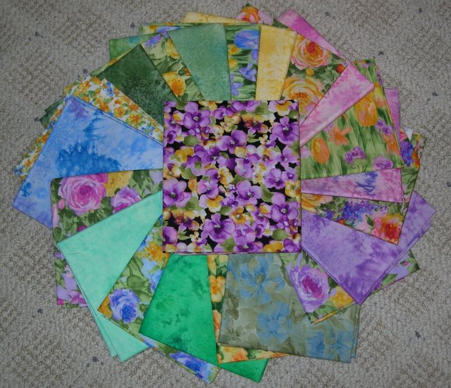
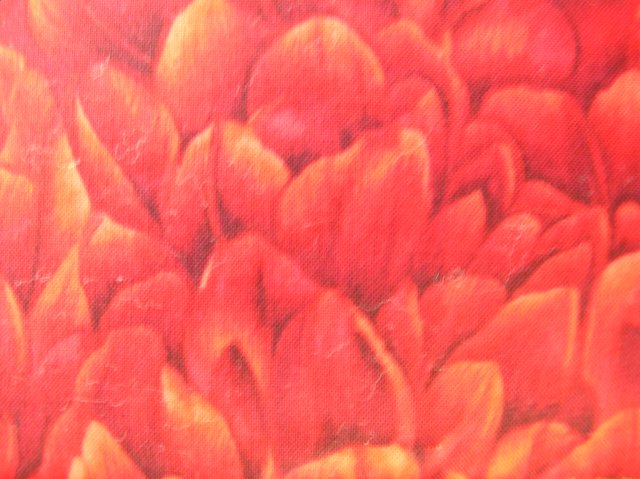 I tried to take a picture of the border red tone on tone fabric – it looks more orange in this picture than it is in real life.
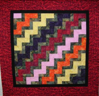
This is how the quilt looks with the borders added. The top has been quilted and is now ready for the binding, label, and hanging sleeve. Good progress for this weekend. 


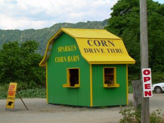
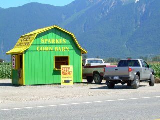
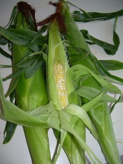 Our community holds the title of “Corn Capital”. We have been enjoying local corn since the beginning of July. I take it for granted that we will have an endless supply of fresh corn, picked daily throughout the summer. We even have the convenience of a corn barn drive through. You don’t even need to get out of your vehicle to purchase fresh corn for supper!