JOY Wall Hanging

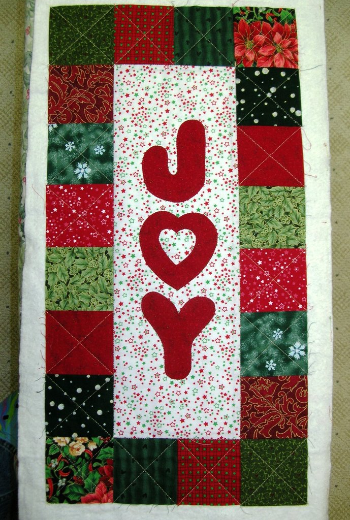
Yesterday was a day to have fun in the studio. With Christmas fast approaching, I was tempted to dip into my stash of Christmas fabrics. I was looking for a quick project that would not add to my never ending UFO list.

This was the perfect project. It measures just 12 1/2″ x 24 1/2″ and can be finished to the binding stage within a day. (The white in the picture is not a border, but is the batting before it has been trimmed away.)

The letters are fused to the background and then attached with a machine blanket stitch. Quilting is simple–an X across each square in the border and then outline stitching around each letter. After binding and the addition of a sleeve, this project is ready to give away as a gift.

Remembrance Day

In Flanders fields the poppies blow
Between the crosses, row on row,
That mark our place; and in the sky
The larks, still bravely singing, fly
Scarce heard amid the guns below.
We are the Dead. Short days ago
We lived, felt dawn, saw sunset glow,
Loved, and were loved, and now we lie
In Flanders Fields.
Take up our quarrel with the foe:
To you from failing hands we throw
The torch; be yours to hold it high.
If ye break faith with us who die
We shall not sleep, though poppies grow
In Flanders Fields.
– John McCrae

BQ Pumpkin Quilt #1 – Quilting Complete


I have finished quilting BQ Pumpkin Quilt #1! I ordered some new Circle Lord templates for my long arm and used two of them on this quilt.

This quilt will eventually belong to my parents so I chose to do a lot of straight line quilting on this one. My dad is always impressed with the perfectly straight lines that my machine can accomplish so that is what is on this quilt. I used the square spiral template in the large pumpkin squares and in the small pumpkin squares on the border. I used the cross hatch template to do the 45 degree angles and my channel locks to do the horizontal lines.

I will save putting the binding on this quilt for another day. I am anxious to load the next quilt and try some different templates!

The next two pictures are taken at an angle to show the quilting design more. Ideally, I would take pictures of this quilt outside but the heavy rains we are currently experiencing means that outside pictures are out of the question.

This is a picture of the back–sometimes quilting is easier to see from the back.

Japanese Maple Trees


These are the Japanese Maple Trees in our yard. I just love these trees at this time of year! These pictures were taken yesterday during a break in the rain showers. We are currently in the middle of a “pineapple express” storm and it seems like the rain will never stop!

Posted by Picasa

Choosing Colours for Quilts

These pictures are of a quilt that I just finished quilting on my long arm. The quilt belongs to a customer. I don’t always post pictures of my customer’s quilts, but I found this one so appealing that I had to share it. The pattern is Yellow Brick Road and it is not the pattern so much that I fell in love with, but the colours and textures of the fabrics. I love this combination of colours–raspberry and teal.

While working on this quilt I have been thinking about starting Judy’s latest Quilt For an Hour quilt. I usually don’t work in just one or two colours as suggested in the samples posted by Judy. I prefer to work with scraps of all colours. Although the centers of the blocks are suited to my scrap bin, I am stuck when I try to come up with two colours to use for the borders and sashing. November may be over before I decide how I will make my version of the Gratitude quilt–I am currently using my hour a day thinking about which fabrics to use!

After working from my paint chips on my paint chip challenge, I discovered how useful paints chips are when choosing colours for quilts. I did some exploring on the internet and found a wonderful site by Behr Paint. If you go to this site, click on “Start Color Smart”. Then select a colour and find other colours to coordinate with your choice. You can choose to see similar colours, see coordinated colours where your colour choice is the main colour, or see palettes where your colour choice is the accent. I think this could be a very useful tool when you are stumped for choosing colours for quilts when you want to do something other than scrappy.

I am looking for just the right combination of colours for my next quilt–something that appeals to me as much as the teal and raspberry combination of my customer’s quilt.